
City halls, DMVs, and government offices all have the same everyday problem—long lines, limited staff, and erratic visitor traffic.
Visitors are already annoyed when they get to the counter, and staff are trying to process walk-ins, forms, and questions all at once. Outdated queue line management strategies just don't cut it to handle today's needs.
That is where smarter strategies enter the picture. With data-driven queue flow management, agencies can identify bottlenecks, adjust staffing in real-time, and make visits more efficient for all parties involved.
In this article, we will explore the benefits of this method and take you through how to begin using the best queue line management tools.
Why Queue Flow and Citizen Satisfaction Matter
In government facilities like DMVs, city halls, and other municipal buildings, queue flow refers to the efficiency and ease with which people navigate the individual stages of the service process—from checking in to being attended to. Efficient queue line control provides assurance that frustration, wait time, and confusion are kept to a minimum.
When queues fail, the consequences go far beyond mere frustratingly long lines:
Frustration builds very quickly, leading to walkaways or complaints.
Staff become swamped, with resultant lower quality service.
Citizens disenfranchise, viewing public services as wasteful or out of date.
Core processes are relegated to the backburner, i.e., voter registration or license renewals.
In contrast, queue flow streamlining improves citizen satisfaction:
Citizens feel respected and better informed.
They are more likely to follow procedures and show up for appointments.
Feedback is more constructive and valuable.
Societies benefit from greater civic engagement.
You might also like - Customer Satisfaction – Make Your Customer Addicted to Your Business
The Role of Data in Queue Management for Government
Data is key to smarter queue flow management within government agencies. It turns mundane activity into actionable insights that can help agencies serve citizens more effectively.
So, what kind of information matters most?
Check-in time – the time when people check in and how long they wait
Service time – the time it takes for individual tasks or requests
Peak times – deciding when the busiest time of the day or week is
Walkout rate – the number of people who leave without receiving service
Service utilization – the units or counters that are busiest
Two types of information can improve queue line management:
Real-time data enable employees to make changes in real time—like changing employees during a surge.
Historical data help agencies prepare for staff, define service standards, and predict demand.
By the local administrations effectively making use of such information, they can make informed choices, reduce unwanted delays, and offer highly customized experiences. It's a building block towards improving overall customer experience in the public sector-making public services efficient, transparent, and citizen-centric.
6 Key Metrics Local Governments Should Track
To enhance queue flow management, local governments must track certain performance indicators that indicate the level at which their services are operating. Such metrics provide a basis for more intelligent decisions, quicker reaction to problems, and greater citizen satisfaction.
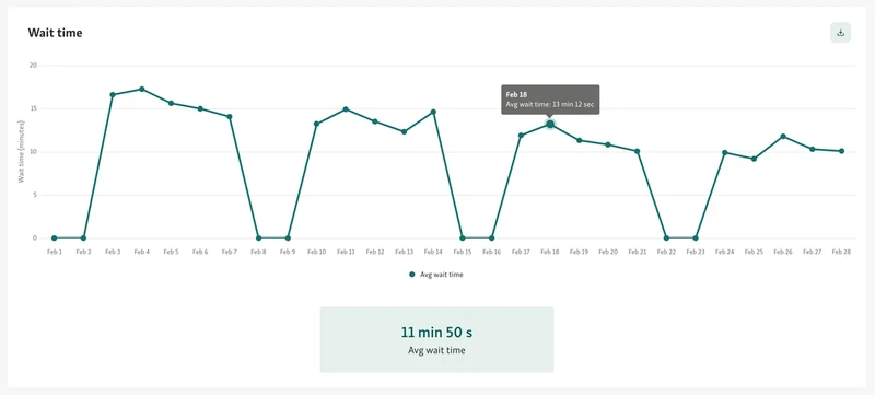
1. Average Wait Time
The simplest metric, but one of the most compelling ones in queue line management, is average wait time. It indicates how long a visitor waits from checking in to getting served.
Suppose your city hall attends to 60 citizens a day. If the sum of the waiting time of all the visitors is 720 minutes, then:
Average Wait Time = Total Wait Time ÷ Number of Visitors
Average Wait Time = 720 ÷ 60 = 12 minutes
That's within a reasonable range. But when another day's data is given with 1,500 minutes of waiting time for 75 visitors:
Average Wait Time = 1,500 ÷ 75 = 20 minutes
This spike indicates holdup, perhaps due to peak-hour overload or staff deficiency. Regular measurement and comparison of this figure across various days allows departments to identify when additional assistance is required or when to spread out appointments.
Monitoring the average wait time also serves to prove the effect of changes. Reducing a wait from 20 minutes to 11 minutes due to the implementation of a new self-service kiosk is a quantifiable gain—both for effectiveness and for citizen satisfaction.
Read also - The Problem With Government Office Wait Times And How to Solve It
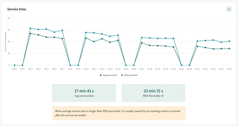
2. Service Time Per Citizen
Service time per citizen means the amount of time it takes to serve one visitor once their queue position has been reached. This is a useful measure of how well staff are processing requests and if certain services are leading to delays within the overall queue flow management process.
For instance, consider a permit window in a city hall. If 5 citizens are served in an hour, the average service time is:
Service Time = Total Service Time ÷ Number of Citizens Handled
Service Time = 60 minutes ÷ 5 = 12 minutes per citizen
This may be okay for more involved problems. But suppose another worker serves 10 citizens within the same hour:
Service Time = 60 ÷ 10 = 6 minutes per citizen
This gap identifies where the queue is slowing down. Perhaps the initial desk has more lengthy requests, or perhaps there's a training problem. Either way, the data provides managers with an obvious avenue for intervention—whether that's transferring staff, supplementing with self-service, or providing extra training.
By tracking service time in conjunction with queue line management data, governments can better control workloads and decrease overall waiting time for citizens.
3. Peak Visit Times
Peak hour visits are the times or days when traffic of citizens is most dense at public service facilities like DMVs, city halls, or permit offices. Tracking this number is key to simplifying queue line management and reducing stress on visitors as well as personnel.
For example, if your queue data indicates that Mondays between 10 AM and 1 PM consistently have 80 visitors, and Fridays only have 30 during the same time frame, then it is apparent where additional staff are required.
Busy periods can be approximated by looking at historic check-in timestamps for a month or quarter. This is a simple breakdown:
Monday (10 AM–1 PM): 240 visitors across 4 weeks = 60 per week
Friday (10 AM–1 PM): 120 visitors in 4 weeks = 30 per week
Now that you have this information, you can:
Increase staffing during peak windows
Drive off-peak visiting hours through reminders or electronic signage
Schedule breaks and shift changes to avoid burnout
Divert certain services online or to self-service kiosks
Through the utilization of this intelligence, public offices can work to reduce crowding and produce a less disrupted queue flow, resulting in a much less agitating experience for citizens.
4. Abandonment Rates (Walkouts)
Abandonment rate, or walkouts, measures how many citizens leave before receiving service, often due to long wait times or unclear queue flow. This metric is one of the clearest indicators of frustration and poor queue line management in government offices.
To calculate abandonment rate:
Walkouts ÷ total check-ins × 100 = abandonment rate (%)
For example:
If you had 25 walkouts on a day where there had been 200 check-ins:
25 ÷ 200 × 100 = abandonment rate of 12.5%
That would be more than 1 in 10 visitors departing your service site without being served- an indication that something is broken.
Having a good understanding of abandonment rates helps public offices:
Identify times, or services that have high walkouts
Make scheduling decisions, or signage adjustments to encourage waiting citizens
Leverage real-time information delivery (perhaps in a text message) to limit uncertainty
Introduce digital queuing to improve visitor perception of wait time
A continuing downward trend of abandonment is a very credible indicator of improved queue flow management, resulting in greater citizen satisfaction.
5. Service Utilization
Service utilization shows which units, counters, or departments are used the most in public-facing offices like DMVs or city halls. This metric helps teams understand where the highest demand is and where bottlenecks are likely to form. Tracking this data is key to balancing workloads and reducing long waiting time in hospitals or government service offices.
For example, if Counter 3 handles 150 transactions per week while Counter 5 handles only 60, you know the flow isn’t balanced. Shifting staff or changing the type of services offered at each counter can fix this.
Here’s how the weekly usage might look:
Counter 3: 600 visitors per month = 150 per week
Counter 5: 240 visitors per month = 60 per week
Once you spot patterns like these, you can:
Rotate services across counters to prevent overload
Assign more experienced staff to high-traffic counters
Use kiosks for simple requests to free up in-person staff
Extend service hours for overused departments
With better resource distribution, offices can improve service speed, cut queues, and offer a more balanced, patient-first experience.
6. Citizen Feedback Trends
While most metrics focus on numbers, citizen feedback brings important supporting context on queue-flow management and overall quality of service. Feedback trends inform public offices not only on what is happening (certainly important), but also why it is happening (even more important).
By categorizing open-ended responses (e.g. surveys, kiosk ratings ), you can aggregate common challenges (e.g. "long wait," "bad signage," "good staff") with further meaning.
Example Workflow:
After members or citizens were served, they rate their experience (out of 5 stars)
A comment field (optional) could allow citizens or members to explain rating
Staff could tag themes on comments e.g. "long wait," "bad signage," "good staff," etc.
Report Monthly, for example, with detailed analysis of various topics and the frequency of those topics being reported.
Why this is valuable:
Identifying hidden service issues that the metrics alone would miss
Understanding and prioritizing service improvements based on citizens or members real concerns
Measuring and tracking service improvements and connecting them to citizens perceptions evaluated over time
Building trust that you have really heard, considered and actioned citizen feedback
Citizen feedback, when analyzed properly, isn’t just opinion. It’s data. And it’s key to aligning queue line management with real public needs.
Helpful read - Customer Satisfaction Metrics You Need to Be Tracking
How Data Improves the Government Customer Experience
Using data effectively can transform how government offices manage queues and serve citizens, leading to a smoother and more satisfying experience.
Smarter Scheduling and Service Forecasting
By analyzing historical queue flow data and peak visit times, agencies can schedule the right number of staff at the right hours. This reduces overcrowding and long waits.
Proactive Communication
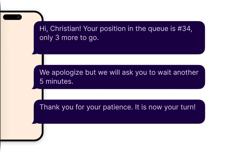
Real-time data lets offices notify citizens about current wait times or delays through SMS or apps, helping manage expectations and reduce frustration.
Better Planning for High-Demand Periods
Data helps anticipate busy times, such as elections or tax season, so extra resources can be deployed in advance to maintain efficient queue line management.
Personalized Service
Insights from previous visits and feedback enable staff to anticipate citizen needs, speeding up service and creating a more tailored, positive experience.
Tools That Enable Data-Driven Queue Management
To put data to work, local governments need more than just spreadsheets, they need integrated tools that make it easy to track, analyze, and act. These systems are essential for managing queue flow efficiently and improving citizen satisfaction in real time.
1. Queue Management Software for Real-Time Visibility and Planning
An exclusive queue management system such as Qminder provides city halls, DMVs, and other public institutions the possibility of monitoring and streamlining their overall service flow. It monitors major parameters including average wait time, service time, and footfall—all in real time.
With Qminder, employees are able to make data-driven decisions in the moment, identify patterns during peak times, and schedule workload more evenly. Historical data reports are also offered through the platform, allowing organizations to analyze performance and long-term improvement plans.
View how many customers are waiting and what they require
Monitor individual and team performance indicators
Make staffing and service changes based on real-time data
Create data reports for internal audits and transparency
Qminder also supports self-check-in kiosks, queuing via mobile, and feedback systems for an end-to-end queue line management solution.
2. Self-Service Kiosks and Mobile Check-In for Seamless Intake
Installing self-service kiosks or offering mobile check-in gives citizens an easier, faster way to start their visit while allowing the agency to gather useful intake data up front. This includes check-in time, service type, language preferences, and more.

This early data capture helps with queue planning, routing, and even predicting how long a service will take—leading to smarter queue flow management.
Speeds up visitor intake and reduces lobby congestion
Captures data that feeds into wait time predictions
Supports walk-ins and scheduled appointments alike
Multilingual interfaces ensure accessibility for all citizens
3. Feedback Collection Systems That Turn Opinions Into Insights
Digital feedback tools, like quick post-visit surveys on kiosks or via SMS, give local governments a way to measure satisfaction in a structured format. While often overlooked, these systems help quantify citizen sentiment and tie it to specific services or visits.
Over time, feedback trends offer critical insights into what’s working, what’s frustrating citizens, and where service improvements are needed most.
Short, targeted surveys that encourage high response rates
Connect feedback with queue metrics (e.g., long waits vs. low ratings)
Identify repeat complaints or compliments by service area
Demonstrate responsiveness and transparency to the public
Read more – Best Queue Management Systems in 2025
Smarter Queues, Happier Citizens
Improving queue flow and citizen satisfaction doesn’t require overhauling every system—just the smart use of data.
From tracking average wait times to analyzing service bottlenecks, even the simplest metrics can lead to better decision-making, more efficient service delivery, and a stronger relationship between governments and their communities. With the right tools, public offices can make daily operations smoother for both staff and citizens.
Platforms like Qminder make it easy to collect, visualize, and act on real-time data.
If you're ready to take the next step toward smarter service, start your free trial today—no credit card required.
Not at all. Smaller municipalities, town halls and local branches are often where queue flow is improved the most. For these smaller offices, resources and staff are limited, and understanding visitor patterns helps to provide more timely service, with less confusion, and their teams do not need to be increased.
Most queue management software tools are designed for ease of use with very little IT involvement. Software solutions like Qminder, are cloud-based, easy to use, and have onboarding support, so even non-technical staff can easily learn to set up and use any features or functions with confidence.
Queue solutions are multilingual, have a screen reader that people can use, and have mobile check-in for people that require mobility assistance. This enables citizens with disabilities, language barriers, or limited knowledge of technology to utilize public services.
Get to know the author

Aleksandra Sõsun Product Marketing Lead at Qminder
Get to know our solutions
We will give you a short but great overview of how Qminder can improve your business and visitors experience.
Try out Qminder for yourself and see how we can improve your business and visitors experience.
Related posts
Best Practices for Managing Customer Flow in High-Traffic Government and Public Service Environments Key Factors That Affect Service Time in Government Services and How to Manage Them 5 Reasons Virtual Queues Are Essential for Local Government Services Like DMVs and City Halls
  7 Key Strategies for Efficient Resource Allocation in Local Government Services