

A strong retail dashboard matters mainly because stores need a quick way to see what’s going on, not ten different tools.
With tighter margins and customers expecting everything faster, a retail analytics dashboard helps teams spot what’s working and what’s slowing things down.
A retail business dashboard keeps the key performance metrics in one place so people can react sooner and cut out small issues before they turn into bigger ones.
In this blog, you'll see the top KPI performance metrics that every retail service dashboard should track and how these business performance metrics directly impact efficiency, customer satisfaction, and store-wide performance.
The Top 5 Retail Service Performance Metrics
Every retail business dashboard depends on a clear set of performance metrics to understand service quality, bottlenecks, and customer behaviour. Let’s take a look at how each metric works and why it matters.
1. Average Wait Time
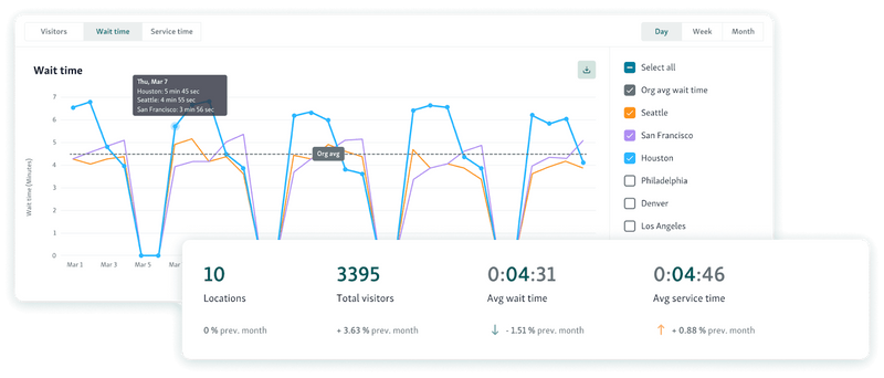
Average Wait Time is basically how long people end up standing around before someone helps them. On a retail dashboard, it’s one of the few numbers that tells you right away if the store feels slow, busy, or completely backed up.
What it’s actually measuring
Just the time between a customer checking in and the moment a staff member finally talks to them.
How it’s calculated
Most retail analytics dashboard tools use this formula:
Average Wait Time = (Total Wait Time for All Customers) ÷ (Number of Customers Served)
Quick example
If all the waiting adds up to 300 minutes and 60 people were helped, that’s:
300 ÷ 60 = 5 minutes.
Why it matters
Long waits push people to leave
Shows where things are dragging
Helps you see if the front area is understaffed
Gives managers something concrete to point to when asking for changes
How to use it well
Check the number by hour, type of service, and each store
Match it with why people came in to find slow spots
Set alerts when wait time gets too high
Compare it with footfall so you know if it’s a staff issue or a crowd issue
Tools like Qminder show this number in real time with service intelligence so you can actually fix issues before the line gets out of hand.

2. Service Time per Customer
Service Time per Customer is a core KPI performance metric on any retail business dashboard because it shows how long staff spend serving each customer from the moment the interaction begins until it ends. This metric helps retailers understand efficiency, training gaps, and where processes may be slowing down.
What it measures
The duration of the actual service interaction, not including waiting time.
How Service Time is calculated
Most retail analytics dashboards use:
Service Time = (Sum of all individual service durations) ÷ (Number of customers served)
Example:
If staff spent 480 minutes serving 80 customers:
Service Time = 480 ÷ 80 = 6 minutes per customer
Some dashboards also break this down by:
Service type (returns, pickup, repairs, consultations)
Staff member
Time of day
Location
Why it matters
Long service times may indicate staff training gaps
Reveals process complexity or bottlenecks at certain counters
Helps managers balance workloads across employees
Directly impacts queue length and resource needs
Shorter service times = faster throughput and higher satisfaction
Best practices
Compare service time across team members to spot improvement areas
Use benchmarks for each service type
Review alongside customer satisfaction data for context
Use time data to build smarter shift schedules
Qminder automatically track service durations across teams and locations, helping retailers plan staffing more accurately and improve consistency.
Helpful read - How to make the most out of data?
3. Customer Arrival Patterns
Customer Arrival Patterns show when shoppers enter the store, by hour, day, week, or season. This is one of the most important performance metrics on any retail dashboard because it reveals demand cycles and helps retail teams plan resources with precision.
What it measures
The distribution of customer arrivals across different time intervals.
How Customer Arrival Patterns are calculated
Most retail analytics dashboards collect timestamp data at check-in, POS, service counters, or entry sensors and then group it into patterns such as:
Hourly traffic curves
Day-of-week variations
Seasonal or promotional spikes
Location-by-location comparisons
Example:
If a store logs:
40 arrivals from 10–11 AM
95 arrivals from 11–12 PM
70 arrivals from 12–1 PM
The dashboard displays a clear mid-day peak, signaling increased load after 11 AM.
Why it matters
Helps schedule staff during true high-demand hours
Reduces wait times by avoiding understaffed periods
Informs stocking, restocking, and setup needs
Supports planning for holidays, weekends, launches, and promotional events
Allows managers to match supply (team capacity) with demand (customer volume)
Best practices
Review arrival patterns weekly and seasonally
Layer traffic patterns with sales data for richer insights
Use historical data to forecast upcoming peaks
Segment by service type for even more accuracy
4. Queue Length and Abandonment Rate
These two numbers basically tell you if the line is getting out of hand and if people are bailing before getting help. Stores watch them because they show what’s really happening when things get busy, not what the reports say should happen.
What they measure
Queue length is just how many people are standing in the queue at that moment. Abandonment rate is how many joined the queue but gave up somewhere along the way.
Queue length – how it’s calculated
Most retail dashboards simply count whoever is waiting at counters, pickup spots, returns, etc.
Formula is:
Queue Length = number of people waiting right now.
Abandonment rate – how it’s calculated
If someone checks in and never finishes service, that’s counted as abandoned.
Formula:
(people who left ÷ total people who queued) × 100
Example:
30 people enter the queue. 6 leave. That’s 20%.
Why stores care
Long lines mean the team is drowning.
More walk-outs means people are annoyed or losing trust.
Helps spot slow counters or not enough staff.
Tells managers when to open another lane or call someone over.
Also helps plan staffing for the future.
How to handle the metric
Watch it live, not the next day.
Set alerts when the line gets too long.
Compare walk-outs across stores to find trouble spots.
Look for patterns, lunchtime, weekends, anything that repeats.
5. Customer Satisfaction Score (CSAT)
CSAT is basically the quickest way to see how customers felt right after the interaction. Not sales numbers, not speed, just whether the experience landed well. That’s why most retail dashboards track it so closely.
What it actually measures
How people rate their visit: Was it smooth? Was the staff helpful? Did it feel worth the wait?
How stores calculate it:
Customers get a simple question like:
“How satisfied were you with your experience today?” They pick a number, usually on a 1–5 or 1–7 scale.
The math is:
CSAT (%) = satisfied responses ÷ total responses × 100
Only the top ratings count as “satisfied.”
Example:
200 people answered.
150 choose 4 or 5.
150 ÷ 200 = 75%.
Why it matters
Tells you how the experience actually felt
Strong link to repeat visits and loyalty
Helps spot issues tied to certain counters or shifts
Makes individual and team performance more visible
How to use CSAT well
Send the survey right after service (SMS, email, or a quick tap on a kiosk)
Keep questions short so people actually respond
Watch the trend, not one day’s score
Compare by store, service area, or time of day to see patterns
You might also like - Customer Satisfaction – Make Your Customer Addicted to Your Business
How To Use These Metrics Together
These metrics work better when you look at them as a group, not one at a time. A retail dashboard starts to make sense when the numbers explain each other instead of sitting in separate boxes.
Wait Time + Service Time
Put these two next to each other. If both climb, something in the process is slow or unclear. If wait time jumps but service time stays normal, you probably need more people on the floor or a shift change. Seeing them together shows where the slowdown actually begins.
Arrival Patterns + Queue Length
Check when people show up and how fast the line grows. Those two numbers make it easier to spot the hours that overload the store. Once you know the pattern, you can adjust schedules or open extra counters before things pile up.
CSAT paired with the operational numbers
If CSAT dips, match it against wait time, queue length, and service time. You’ll usually find the cause right there, peak hours, one slow counter, or a shift that needs more help.
Abandonment Rate as the early warning
When more people walk away and the line is long, you know exactly where patience runs out.
It’s a quick signal that staff need to be moved or a step in the flow needs fixing.
Using everything in a loop
Look at the data, try a small change, and then check the numbers again. All the metrics together help you stop reacting late and start spotting issues before customers feel them.
Also read - Best Practices for Managing Customer Flow in High-Traffic Government and Public Service Environments
Building a High-Performing Retail Dashboard
A retail dashboard works best when it pulls the main numbers together, not when it looks polished. You watch wait times, service times, rush-hour spikes, people leaving the line, and CSAT. Put them side by side and you can usually see where things start slipping.
That’s the whole point, finding the slowdown early instead of guessing. It also helps when you need to explain why a shift needs more people or why a step in the flow keeps causing issues.
If you want all those numbers in one spot without juggling extra tools, Qminder has a dashboard that shows everything live.
Start your free 14-day Qminder trial today.
Most dashboards pull in whatever the store already uses, POS numbers, basic CRM info, foot-traffic data, appointment logs, and queue stats. The goal is just to get everything in one place so teams don’t jump between tools.
Busy stores should look at the numbers pretty often, sometimes a few times a day. Smaller shops can get by with a weekly check. What matters is keeping a routine so changes don’t sneak up on you.
Yes. When every store uses the same KPIs, it’s easier to compare locations, see which ones need help, and keep service levels steady across the board.
Get to know our solutions
We will give you a short but great overview of how Qminder can improve your business and visitors experience.
Try out Qminder for yourself and see how we can improve your business and visitors experience.